Continue reading if you think journalism is cool. If you do, we'll get along great.
Changing Tides:
The Clarion had recently entered a phase of mainly digital presence, and had been leaning further away from traditional editorial mediums. The branding needed to reflect this change, while still allowing for designers and photographers to flourish both online and in the books.
An Update or a Replacement?:
While the previously used branding (created by Bryson Rosell) had many strengths to offer The Clarion as a whole, some smaller tweaks offered a new dimension and life to the brand. While the current branding may seem quite distinct, it is my attempt at creating the same vibe that The Clarion was renowned for.
So...now what?
To follow in the steps of the leadership direction for the year, I tweaked the design under the following criteria: Gracious. Bold. Empowering.
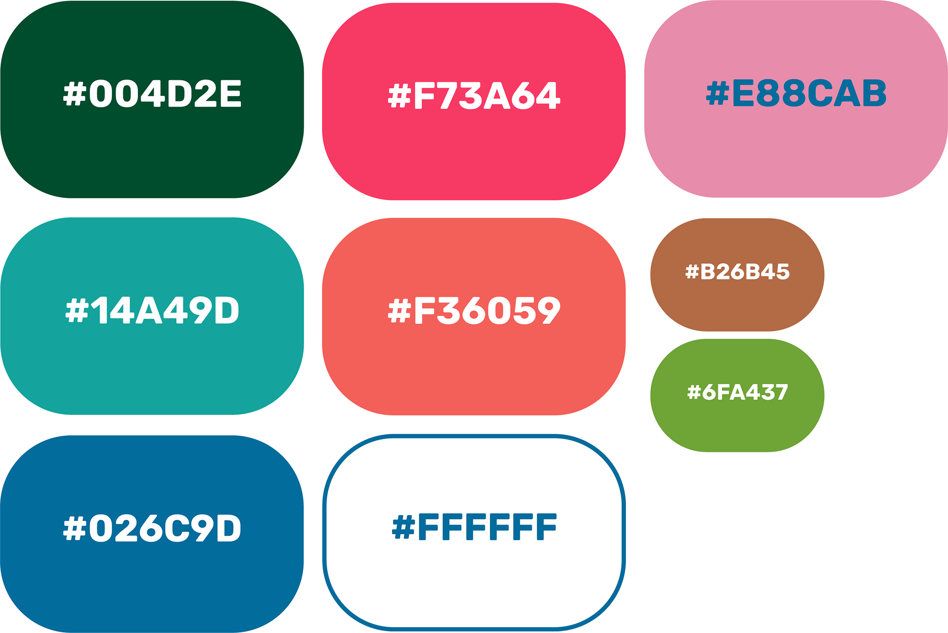
Why these colors?
This color range allows for creativity with color choices, as well as being more vibrant for the sake of digital display. About half of the colors will translate well into CMYK format for the bi-annual newsmagazine.
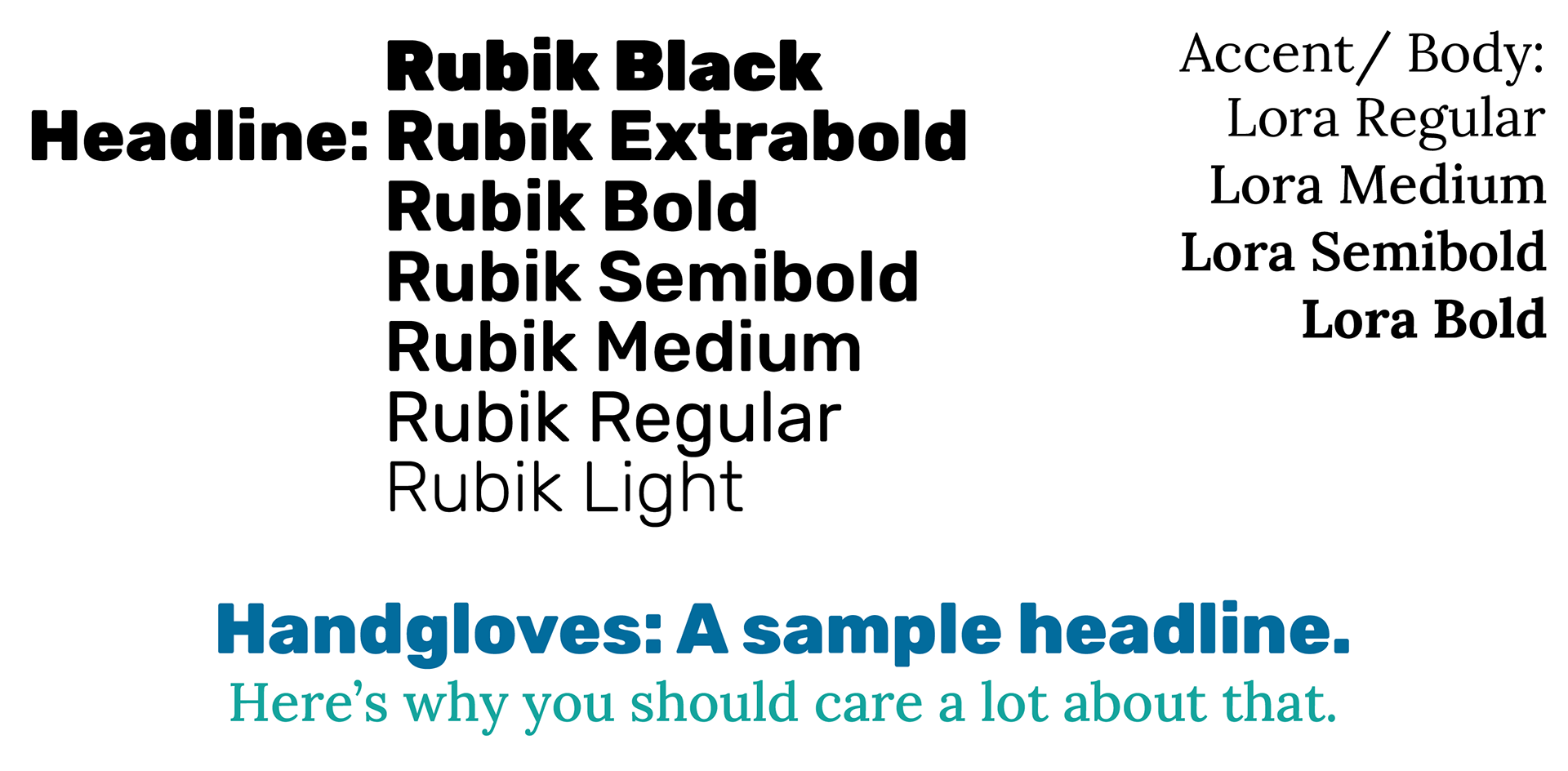
Why these typefaces?
I wanted to transition away from using Adobe Typefaces to ensure the accessibility of the faces to any user that may design with this template in the future.
Rubik is a more simplified, geometric version of the typeface that served its purpose before: Anek Latin. "Claire," I hear you say, "Really? Simplifying the typeface? Is it 2011 again?" And while I understand, I have a good reason. I promise. By reducing the typeface to a simpler form in Rubik, it allows the design to have more creative expression, the photography to come through stronger, and the words to be more legible in nonstandard areas (i.e. an instagram post, reel, or as a subhead on the website).
The idea behind Lora is less sophisticated. Liberation Serif is a particularly solid body copy typeface (hence why it's all over my website!), so I looked for the closest equivalent I could get, where I discovered Lora. I was also attracted to the four different font weights, and their respective italic variants (this is also the case for Rubik. Yippee!)
Both typeface families are available on Google Fonts.
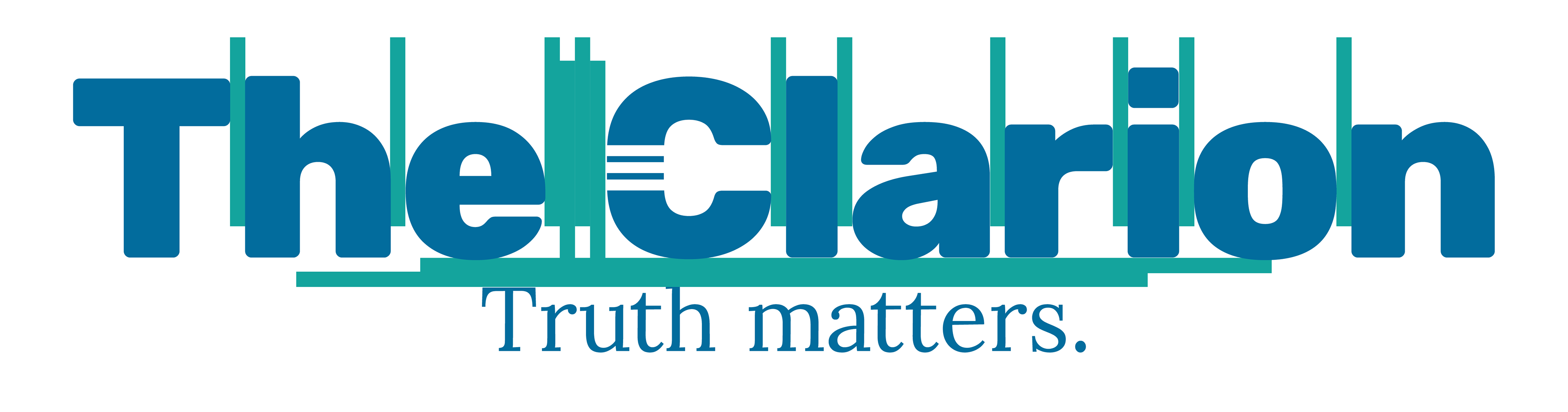
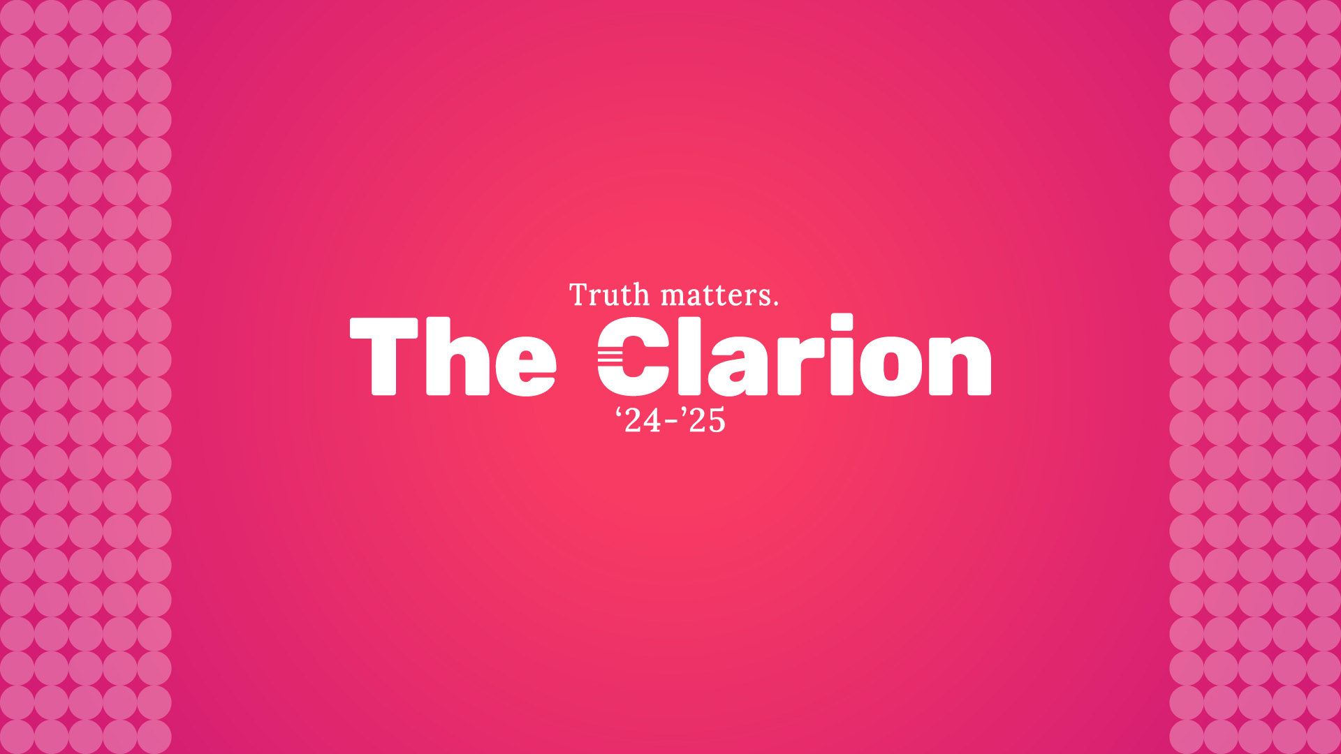
Cool Logo!
Thanks! I made it myself. The logo for The Clarion is "The Clarion", typed in Rubik and kerned in a grid-like fashion. The well-known "C" has been sliced into such that a double line can be seen going through it, referencing the common visual motif of the brand. "Truth matters", written in Lora, can be seen below.