

This is a theoretical art department rebranding for the private college Bethel University in MN. The research for this project consisted of situation audits for Bethel University and its brand guidelines, Bethel's instagram page, Bethel's art department page and instagram, as well as previous materials released by the art department in promotions. Surveys were conducted as well, gathering information from the general student body (and a separate study done for art department students) regarding impressions and characteristics of the art+des department.
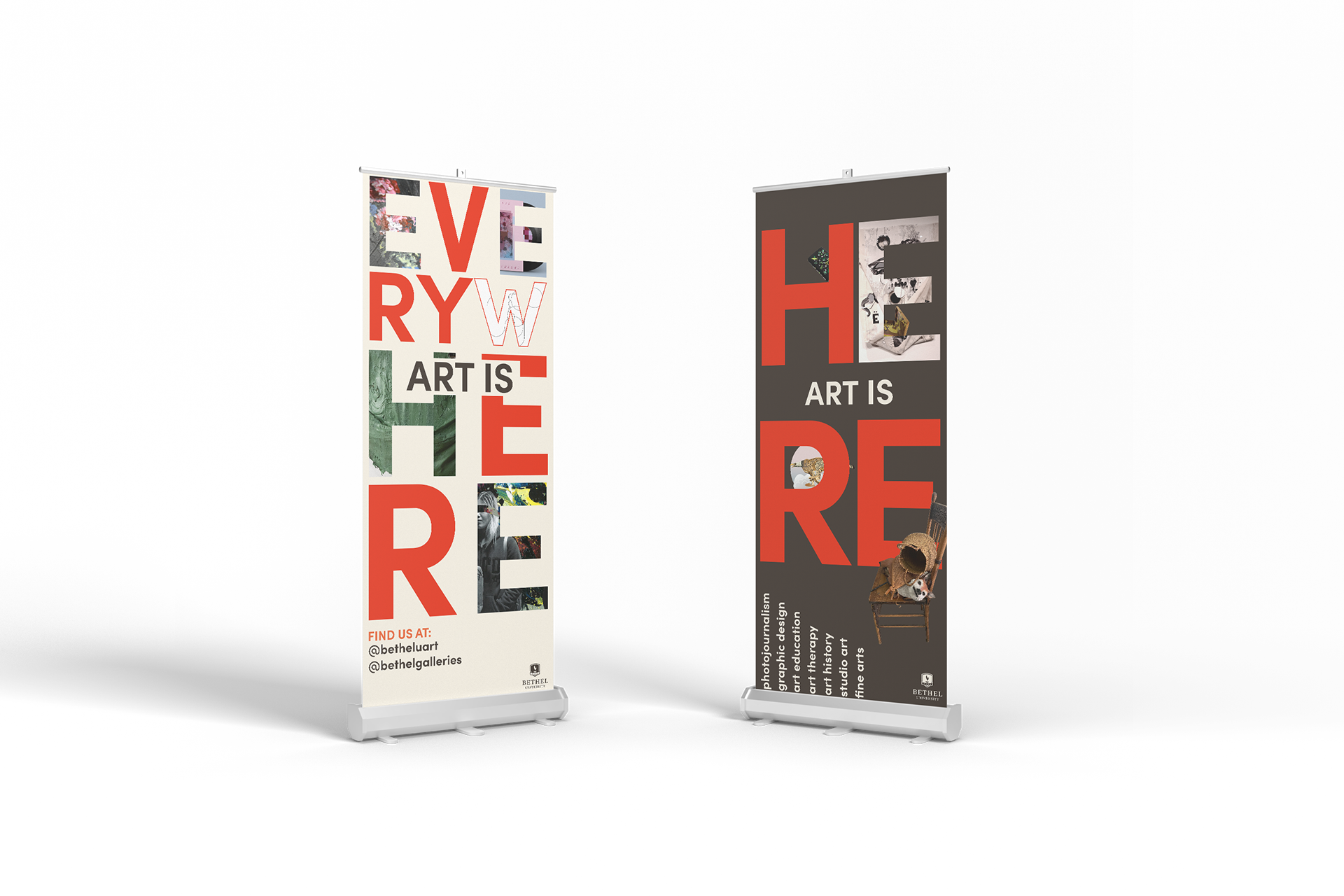
After sifting through a few options, I found that the best way for me to respond to the opinions and misconceptions of students that were wary of pursuing art and design were to literally tell them what the department wishes to. From this line of thinking, the "ART IS" motif began.
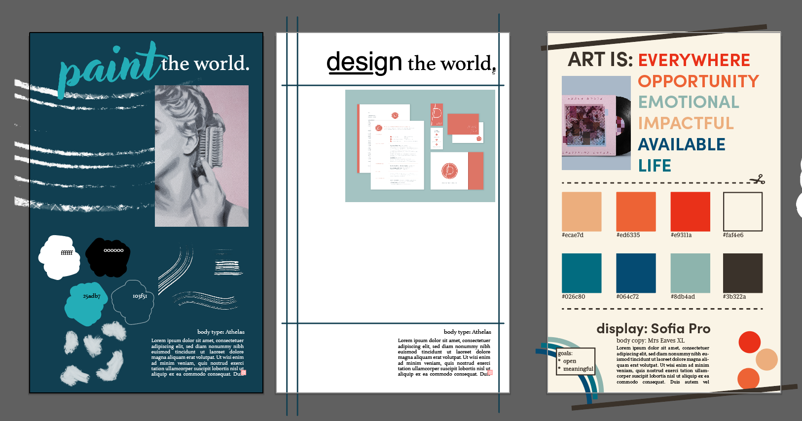
I ended up with a color scheme that had eight different viable colors, which led to my decision to keep most of the design in the typography itself. Over the course of the brand's development, I found myself doing "two steps back, one step forward" with my branding – simplifying it, then complicating it just a touch.
Final Product

The showcased deliverables were the result of a back-and-forth between deciding how to respond to peer ideas of the department, while also ensuring that the department at least somewhat feels like Bethel University, or at least doesn't harshly oppose their set brand guidelines.
I opted towards a retro-feeling color scheme, as it gave me the impression of a friendly, accessible color palette that wasn't too harsh on the eyes, thanks to the off-white and off-black. Not to brag, but I carefully coordinated the colors of those specific colors so that they would feel just right in the brand.
The other major element of this branding is the utilization of letters as clipping masks specifically for artworks made by students in the department. The display typeface, Sofia Pro, is perfectly geometrical in such a way it makes for great clipping masks.