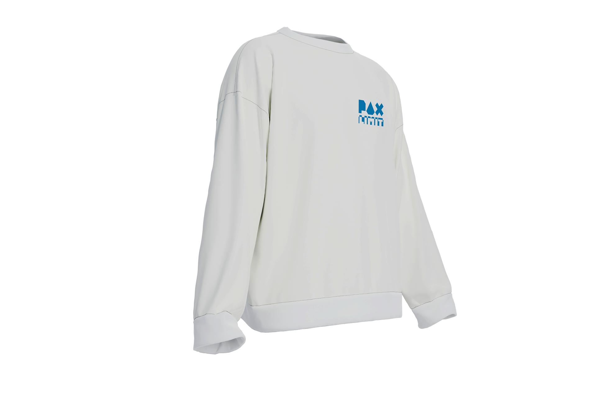
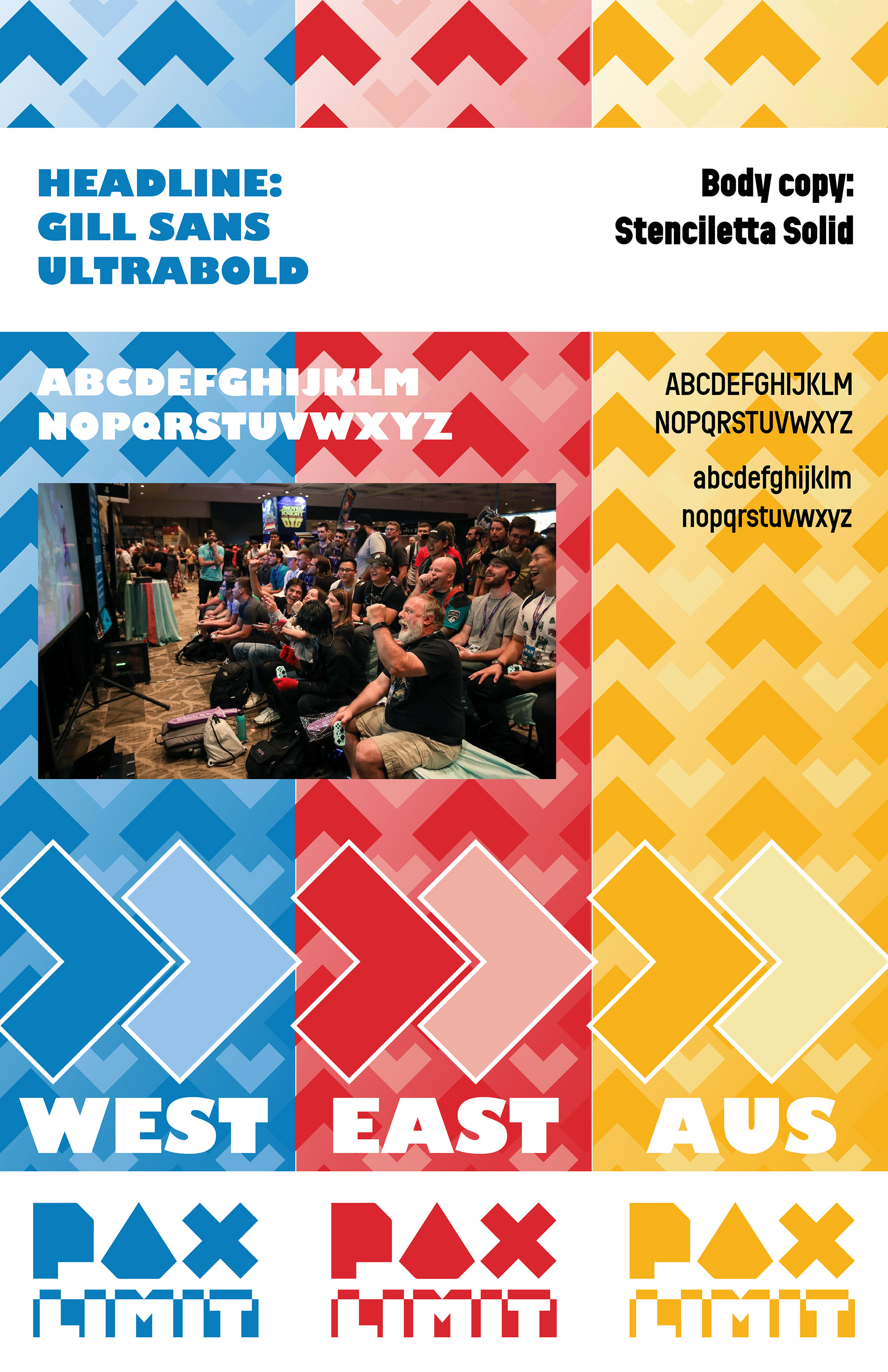
PAX is a gaming conference usually held in three locations – United States on the west and east coast, and one more event in Australia. This summer conference is a gaming expo where several large and small game companies, plus plenty of gaming content creators gather once a year for events, announcements, and plenty of merchandise selling. The goal of this theoretical branding project was to create a one-year-exclusive theme for PAX to run for their event. I chose to go with the theme "Limit pushing", so the word mark I ran with was "PAX LIMIT".

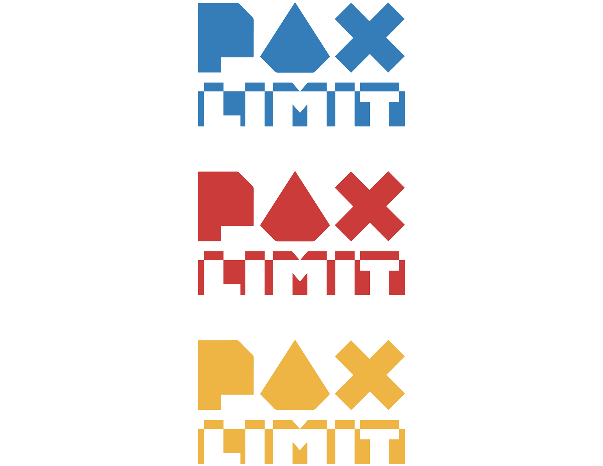
Like I tend to do with my design projects, I started with my logo. Before I even chose to run with "LIMIT" as the word mark, I was going between a few different options, as can be seen on the left. Ultimately, I chose to run with LIMIT because of how much visual potential that the word, combined with Gill Sans, had with the bar motif ever important to PAX's branding. I really liked how I got the tips to cut out of the bar, creating a cool pattern in that moment.
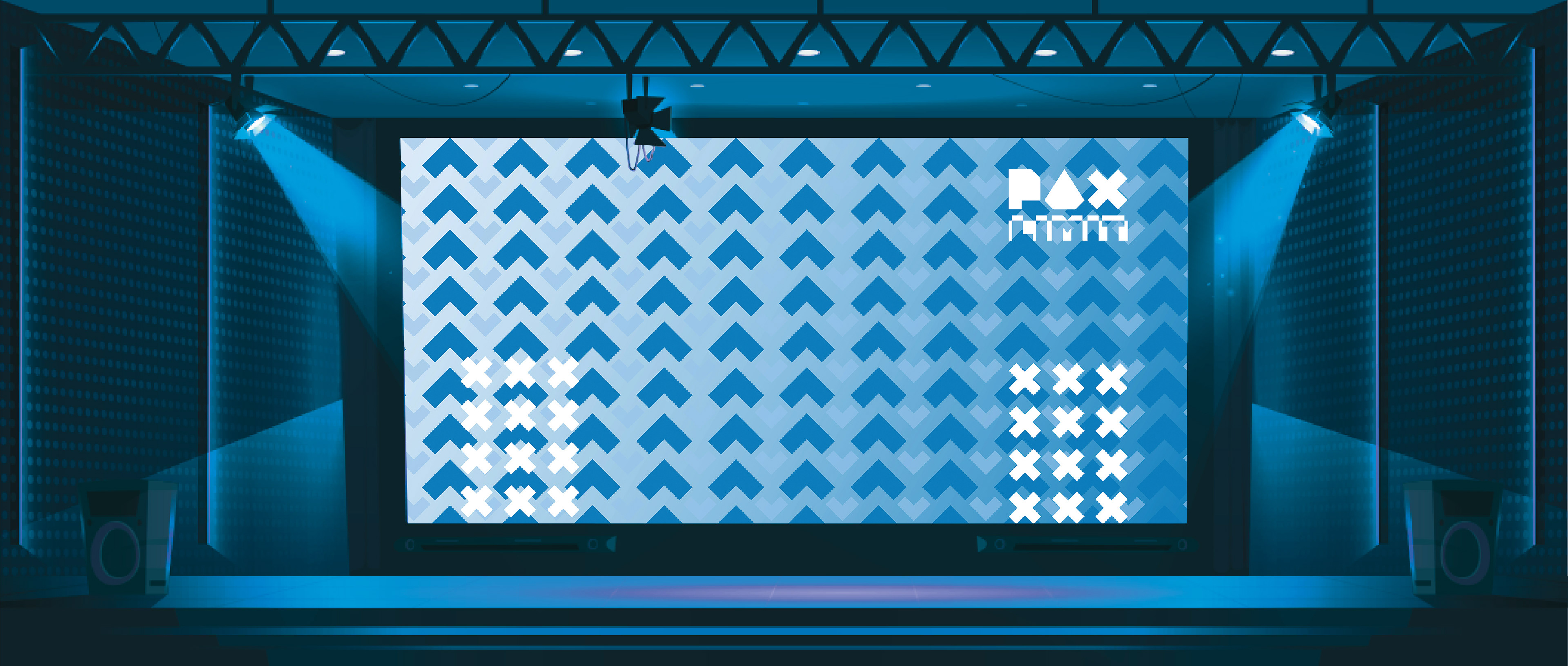
Since the event has three different branding guidelines, I designed mostly in PAX West, to keep things consistent. Switching over to different events would only require colors to be shifted.
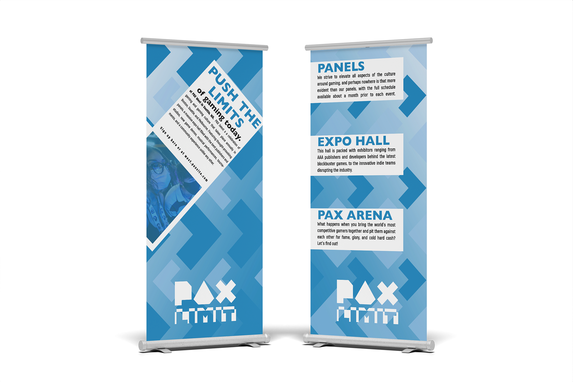
Final Product
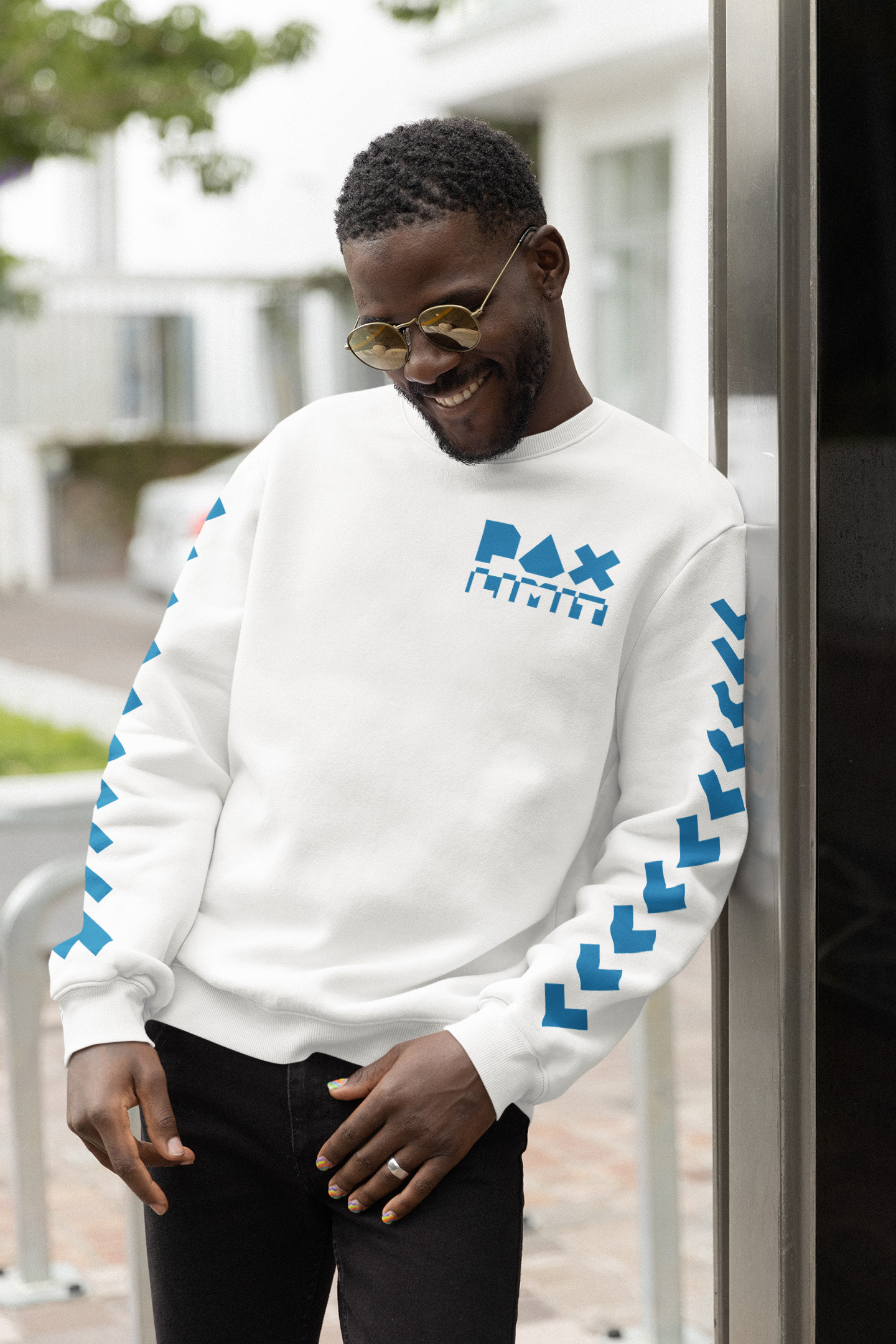
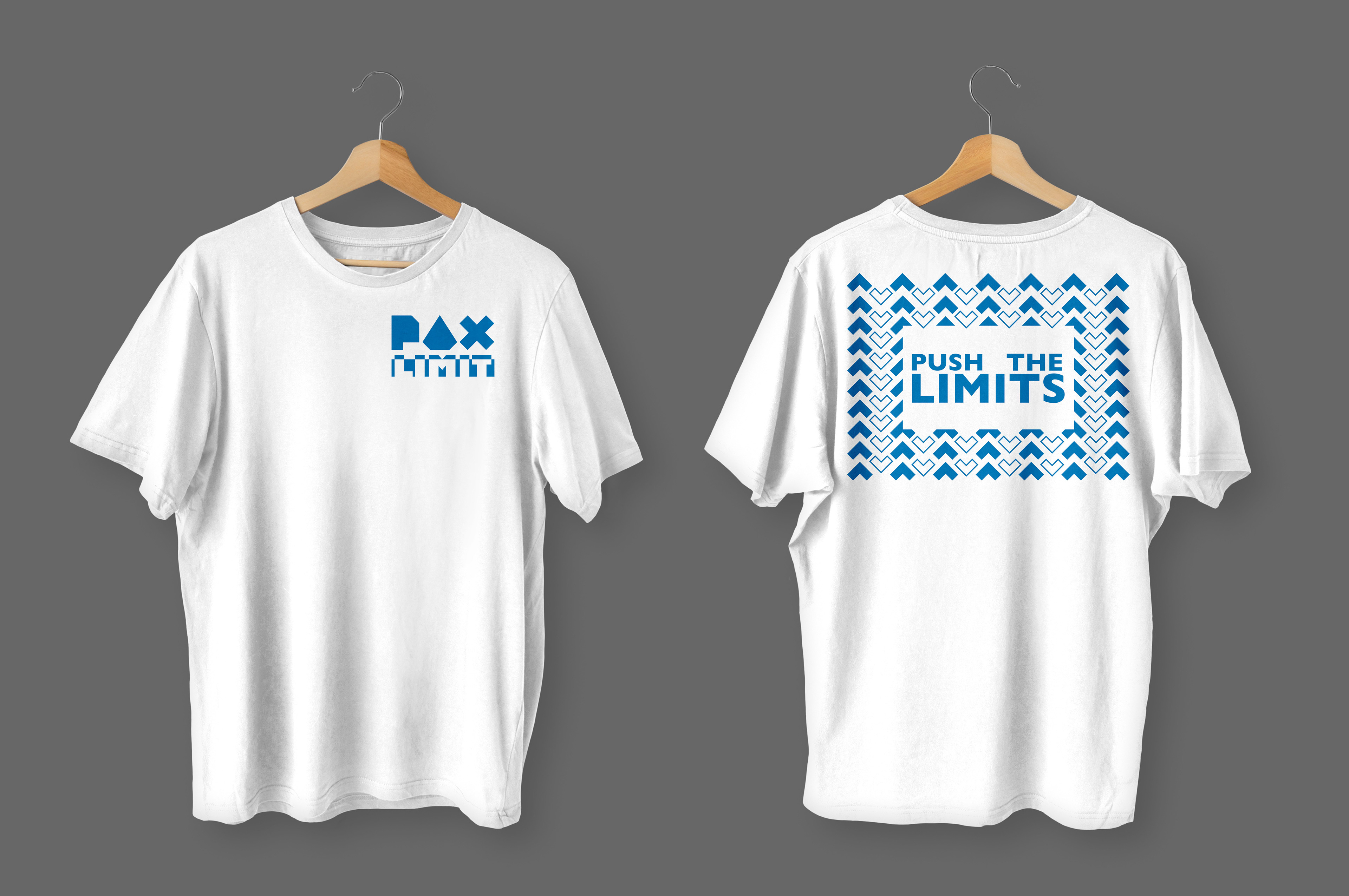
Using the original PAX logo, I created an arrow with the geometric X. This functioned as my main visual asset due to the relationship between it and my logo, and also with how well it fit into the theme. I was able to utilize this asset across my branding in different ways. Specifically in the stage design, an opportunity for animation is present, whether it be panning over a field of the arrows or the movement of the arrows themselves.