

Design Goals / Process
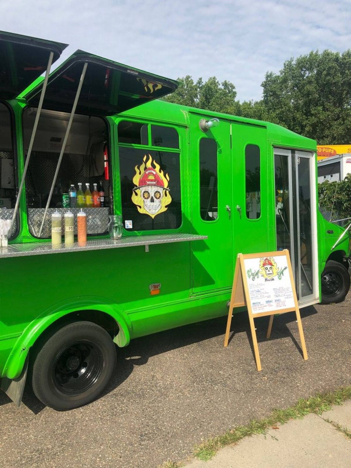
El Fuego Taqueria is a food truck located in Minneapolis. Their online presence is minimal, and they focus largely on their in-person experience.
The project goal? Create a visually captivating experience that consumers will flock to and enjoy.
Through relentless research I concluded their target audience, as well as their unique edge over their market that they could lean more strongly into.
The brand direction was emphasized to be authentic, bold, and flaming.
~~~~~~~
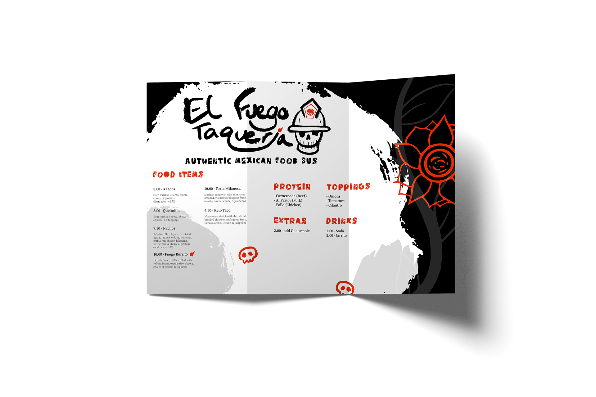
Deliverables: Merchandise mockups, menus, branding guidelines, food truck wrap (which doubles as a spot for photography)

I took one element from the previous branding scheme and ran with it; the Día de los Muertos decorated skull with a firefighter hat. This was the basis of my final branding direction. Understanding the general idea of Fuego's target audience, being local low-middle class people of varying ethnicity and culture, I applied design principles to convey a sense of Mexican culture while ensuring the voice of the type of food served was also present.
My main technique for the branding was to create handmade elements using dry brushes in Procreate, followed by transferring the images to Illustrator and vectorizing them using different accuracy ratings to give them the grungy feel present in the final designs.
Final Product
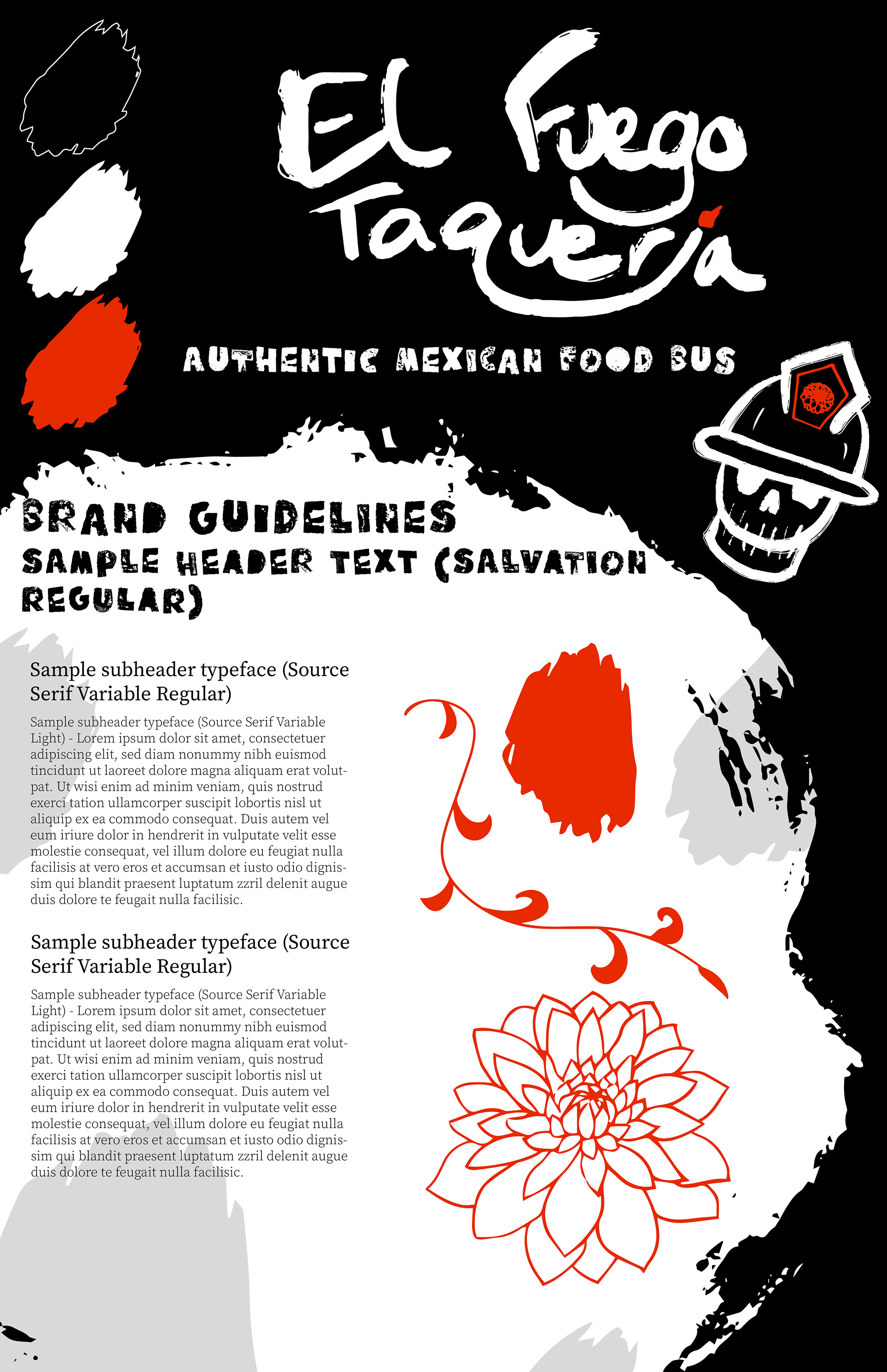
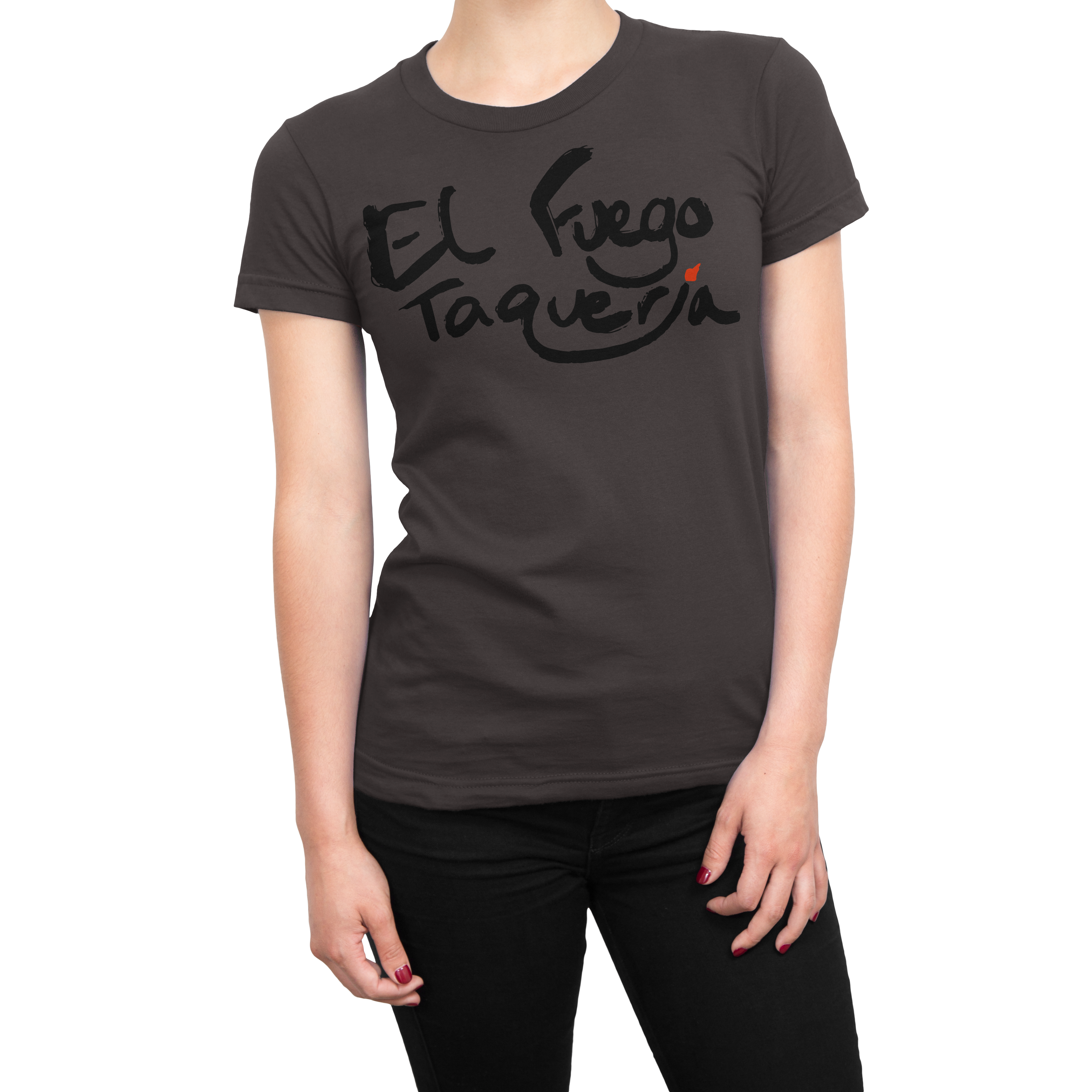
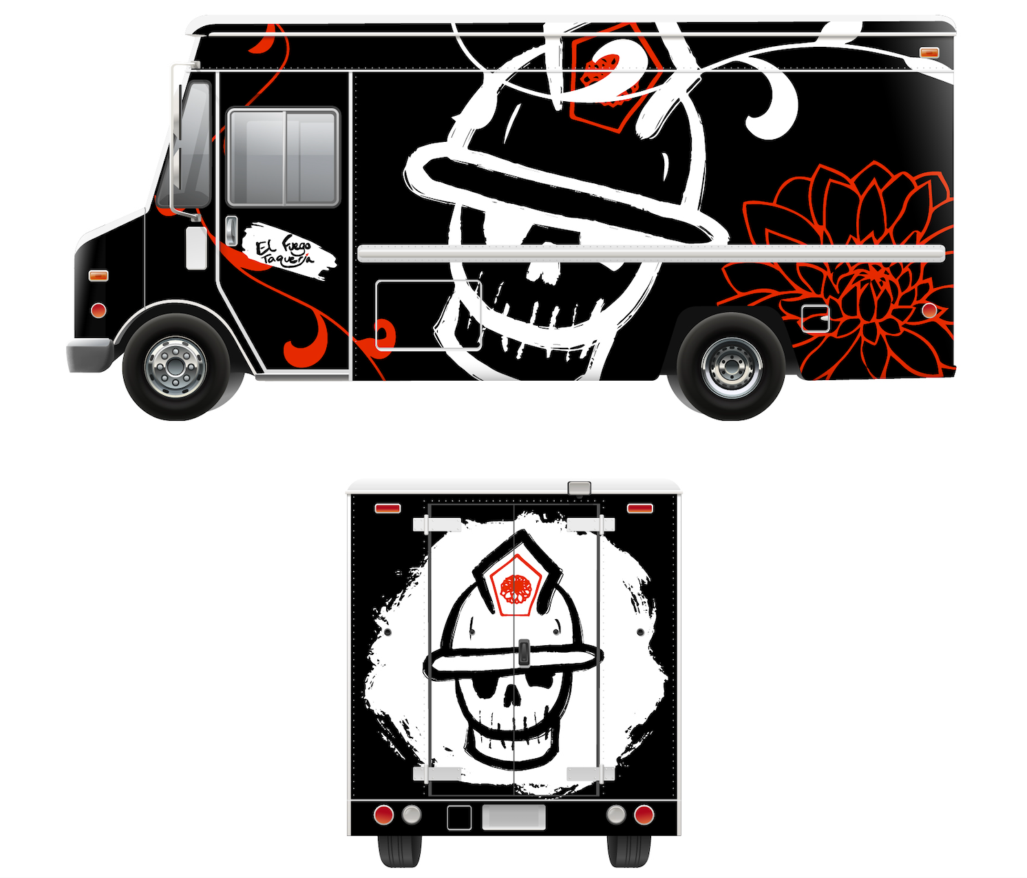
My goal with the final elements were to attain three characteristics – the grungy feel that suggests a level of spice, the authentic Mexican imagery, and finally the trendy composition of the elements. This final branding features a large amount of scale shifting that allows for the branding elements to fit in many different places, from t-shirts to trucks. The abstract application of branding elements leaves the door open for plenty of future installments, and even allows for the brand itself to develop. The hand-made logo is the first impression of the branding from a pedestrian's perspective, and the backside of the truck is the first impression for people stuck behind it in traffic. The idea behind the truck is to be a photo op from as many angles as possible, therefore large scale shifts were used for ideal photo op moments.